I was browsing Facebook (something I don’t do very often) when I saw this (incorrect) table of numbers presented with the caption “what am I doing wrong?”

Now, the table was developed by my friend, George. George is my late father’s best friend. He’s a kind, thoughtful, intelligent, empathetic man who I have always admired, so I couldn’t dismiss this out of hand as a bad faith effort. I have to interpret this as George asking for advice on what he was doing wrong.
So, I promised George I would help and this is my attempt. I am not an epidemiologist, but the core of this challenge comes from an understanding of statistics, something which I do know some things about.
So let’s start with what George was trying to do, he was using this website as source data to calculate the likelihood of catching corona.

So, let’s try help George make sense of this data. Firstly, we need to set ourselves a goal, the implicit goal is determine whether you’re more or less likely to be infected with COVID if you are unvaccinated, and if so, how much more or less? In statistics, we would say we have a null hypothesis and the hypothesis states “vaccination status has no impact on COVID infections”.
Now as the Irish joke states “I wouldn’t start from here”. I personally wouldn’t trust data on a website called “public.flourish.studio”. So the first thing I did is check the origin of this data. Turns out Flourish Studio is an app for data visualisation. In this case, it’s been used by someone called Farah Hancock. A bit of googling found this article.
So where is this data coming from? Probably ultimately coming from the publicly and freely available data on the New Zealand government website. I note that for data geeks, the New Zealand government has a whole CSV full of detail as well.
It’s always good to use verified official sources of information. So, ideally, we would go back to the source, but I don’t think that’s what we should do just yet. Let’s do what George was trying to do and make sense of this graph in isolation, let’s use this to try figure out what the relative likelihood of someone catching COVID might be, based on vaccination status.
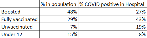
So, what is going on here? Well, on the left hand column we have all the people in New Zealand, broken down by percentages that have different levels of vaccination status. The middle column is the 7 day rolling average of “new cases” of COVID per day. The last column is the 7 day rolling average of “new hospitalisations” where the people were found to be COVID positive. I draw your attention to the footnote which says “data includes people hospitalised with COVID-19, but not always due to COVID-19” this is going to be an important point in a bit.
There are two difficulties we have with interpreting this data as it stands. We don’t have accurate information about “partially vaccinated” people, the number is somewhere around 1%, but it’s hard to say if it’s being round up or down. I propose we exclude the “partially vaccinated” because statistically they are such a small group that our analysis would not be accurate at all.
The second problem is that “new cases” is a self-selecting group. A self selection bias happens when individuals select themselves to participate in a study, therefore the sample is already biased. In this case, presenting yourself for testing is an optional thing which people can choose to do. Some people suggest that unvaccinated people might be less likely to show up for testing, it’s hard to say if that’s true, but we can avoid this bias by looking at the last column: hospitalisations.
In this case (as we determined before) we are seeing people who happened to be in hospital who tested positive for COVID. Whether they were in hospital or not was effectively independent of their COVID status or vaccination status. This is a good thing because it’s effectively a kind of “sample” of the general population.
So, what’s happening here is we have people in New Zealand with certain demographics (vaccination status) and we have a sample taken from that broader population (people in hospital) and we then apply a measurement to that sample (do they have COVID or not?). This should be enough data to calculate what we want.
What we really want to get to is to calculate a “percent infected” value, but we can’t really. To do that we would need: Number of people infected / Total number of people. If we knew the number of people in hospital, we could calculate that ratio pretty easily. Given we’re stuck with this graph we’re going to have to start making some assumptions instead: what is the total number of people in COVID positive in hospital on any given day? Let’s call that number “H”.
Let’s assume H = 100 for our purposes. We’re going to learn that the exact values for H don’t actually change my analysis but it helps to have specific values.
So, we now can easily calculate a number of people in each vaccination status group that we would expect to have COVID if the chance of infection was the same for every group:

OK, so that was very simple, and you might say “duh, you didn’t need to do much of a calculation” but I think it’s important to think about this carefully. We are saying that if the rate of infection for all vaccination groups is the same, then we would expect almost half of the COVID positive people to be boosted. Why is that? Well, that’s because almost half of the population is boosted!
This value is now the value of our null hypothesis. If the actual values are very similar to these calculated values then we have to assume vaccination status has no impact. This is the principle of the P-Test in statistics.
OK, so we know what it would be if there was no impact of vaccinations. Let’s calculate what the actual counts are according to the data we have:

Wait, hang on a sec, what’s going on here? The actual number of boosted people infected is half that which was predicted, and the actual number of unvaccinated people infected is more than double than we predicted.
Could we use this to calculate a relative likelihood of contracting COVID? Yes, I think so.
Let’s calculate the proportion of actual count versus predicted count:
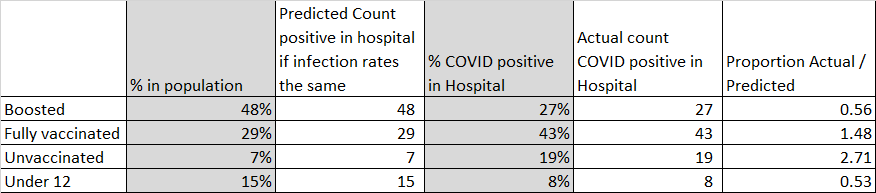
OK, so boosted people are actually getting infected about half as much as we expected them to and unvaccinated people are getting infected slightly more than twice as much. So, in answer to our original question, you are more likely to be infected with COVID 19 if you are unvaccinated.
So, can we then determine what proportion that is? Yes, let’s take all of the last column as a ratio of the first row:

Here we can see that an unvaccinated person in hospital is 4.8 times more likely to be infected than a Boosted person.
So you might say that since I selected a value of 100 for “H”, I have biased my analysis. What about other values for “H”? Well, turns out that “H” is cancelled out in the maths:
Boosted = (0.27 * H) / (0.48 * H) = 0.27 / 0.48 = 0.56
Lastly, I would also like to note that “infection” is different from “disease” someone could be “infected” with COVID and not actually have many or any symptoms. Research suggests that vaccinated people are far less likely to contract the disease. If you want to read much more educated takes on vaccination and COVID, then I encourage you to follow Chise on Twitter.
Her latest tweet at time of writing:
Rates of COVID-19 Cases and Deaths by Vaccination Status per the CDC:
— Chise 🧬🧫🦠💉 (@sailorrooscout) March 13, 2022
Unvaccinated: 2053.6 cases per 100k
Vaccinated: 823.6 cases per 100k
Boosted: 642.1 cases per 100k
Unvaccinated: 12.6 deaths per 100k
Vaccinated: 1.8 deaths per 100k
Boosted: 0.4 deaths per 100k
I’d like to end this blog post on a positive note and one of my new favourite songs by Barenaked Ladies called “Odds Are”. The song suggests that the odds of falling in love are greater than most of the odds of awful things happening to you in your life, so, the odds are we’re going to be alright for another night.