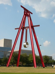
 Last week Sunday I went to the Dallas Museum of Art. This wasn’t planned of course, most of the best things in life aren’t. I had just finished church and lunch afterwards (as usual) and was making my way home through the city. It was about 1pm. As I drove towards my turnoff, I decided to carry on going into the heart of Dallas so I could take some pictures of this vibrant metropolis. I stopped in the shade of a large apartment block and got out into the hot, muggy Dallas air. I walked around the reserve bank on my way to the heart of the city sweating profusely. The image on the right is a sculpture that greeted me as I entered the city proper. This behemoth stands sentinel over the I35E and against the pale blue Dallas sky, it’s quite striking.
 I carried on walking in through the city, happily snapping pictures of the impressive architecture, mainly consisting of steel & glass monstrosities rising hundreds of stories towards the Texas sun. Imagine my surprise then when I happened upon this lovely old chapel, juxtaposed against the harsh steel-blue reality of the city. This, I soon discovered, was the Dallas Arts district: A place where a tourist like me might go to see some unique and interesting things. I couldn’t believe my good fortune.
It turns out that the heart of Dallas is brokein up into 8 districts. Arts, City Center, Main Street, West End, Reunion, Convention Centre, Government and Farmer’s Market to be precise. I had stumbled on what had to be one of the more interesting districts on offer.
 I immediately went over to the first interesting place I could find: the Nascher Sculpture centre. Unfortunately at the time, the place was filled with an architectural exhibition. Now, I love buildings, but I am not too interested in the technical details of how they are constructed. I was after beauty, not necessarily substance. That said, there was a lot of excellent content available. For example, the image on the right here is Picasso’s “Head of a Woman”. Now, I don’t normally go for art that doesn’t reflect the true nature of things but I couldn’t help but be intrigued by this object. Despite its apparent ugliness, it is actually a thing of great beauty and was something I came back to a number of times to have another look at. I don’t always agree with Picasso’s stuff but this one, I can kind of appretiate in my own way.
 Another notable piece was this very lifelike statue by Auguste Rodin called “The Age of Bronze”. His subject was a 22 year old Belgin soldier called Auguste Neyt, who was not a professional model. This combined with the fact that he was supposed to be holding a spear, leads to a strangely “lifelike” pose. Interestingly, Auguste was originally criticised for the “lifelike” quality of the statue. Art critics suspected he had created it by moulding his subject’s body directly (so called “cast from life”). This was a heavy blow for Rodin and his career. It was first exhibited unnamed, then named “Age of Bronze” to play off the idea that it looked like the subject was “awakening” as ancient man in the bronze age. Or, perhaps he just has a headache.
 Outside, I was treated to a whole range of interesting sculptures, most of which kind of broke my original mental model of how a sculpture should look. For example, this one: “Walking to the Sky” by Jonathan Borofsky consists of painted fibreglass figures walking up a pole to the sky. I was enthralled. The artist says it’s a tribute to our aspirations and the resilience of the human spirit. But so close to the CBD of a thriving metropolis, I couldn’t help but draw parallels to the cutthroat corporate world. Were these people climbing a pole to the sky to seek answers, to push on ever upward or to fall despondently to the ground when they realised the pole stopped abruptly 100 feet in the air?
I walked up to the statue to look at the figures walking up the pole, these questions boiling in my head. Then I turned to the people around me to see their reactions and I realised with a start that they too were fibreglass people, looking up in wonder as I was. I suddenly got the feeling that I was part of the statue or the statue was part of me, perhaps that is part of its charm.
 I really enjoyed the statues that had a human element, rather than the abstract ones. This one depicts a small group of six people, all huddled far too close together for the wide expanse of space around them, all looking dejectedly in the same direction, not at each other. They all look old, worn down, defeated. There is a sense of being in too close to each other, but of also being distant and disinterested in the things around them. Naturally, this bronze by George Segal is called “Rush Hour”.
This larger bronze crowd is far more chilling. Standing so uniformly, they could be intended to be a group of soldiers, or prisoners at a concentration camp. Even without their heads these figures stand quite tall and impressive, almost threatening. The coarse cloth-like texture of their bodies lends a wildness to them and also a rag-tag kind of feeling. From afar they are alike but from close inspection they are unique. Looking behind them you can see that they are completely hollow and without substance.
This is Magdelana Abakanowicz’s “Bronze Crowd” which is intended to illustrate the de-humanising effect a crowd has on its constituents. In her own words: “A crowd is the most cruel because it begins to act like a brainless organism.” It is crowds of people, after all, responsible for the horrors of war, not individuals.
 I eventually tired of the statues and went along to the Dallas Museum of Art. Now that was a pleasant surprise. For the same price I was literally inundated with art. It’s not possible to take in the whole museum in one day, let alone the 2 or so hours I had let before closing tie (5pm). The place is full of beautiful art from all over the world. From Europe, Africa, the pacific, from classical Greek to modern abstract stuff, from art for arts sake to something as simple as a chair, it’s all here.
 I found myself drawn to the realist artwork, of course, particularly the European and American work. One such painting caught my eye several times and I couldn’t help but wonder to myself: “that has to be one of the ugliest woman ever painted”. One would assume that a kind artist would soften the blow a little and make her a little less… masculine. I eventually couldn’t resist and had to check out the description. Sure enough the painting is of a man… in a dress.
Queen Anne of England gave Edward Hyde the governorship of New York and New Jersey in 1701 for switching his loyalties from her father James II in the English revolution of 1688. Because of this he became quite unpopular and this painting of him in a dress was probably a popular form of political slander.
I saw many other varied art works there, from solid gold Inca cups to bits of wire jutting out of the walls. I will have to go back and see everything I glossed over. Finally, in keeping with my attempts to have more of me in photos. I took this while I was looking through a fine collection of silver.
